

- Little note on the back saying that you'd love to work with that company - something extra, stands out.
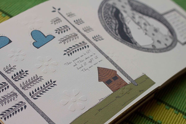
- Textures - making the most of a physical portfolio.
- Strong, bold typography


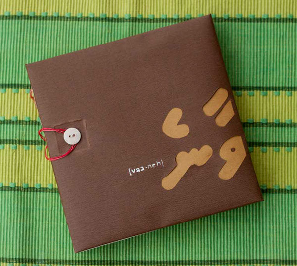
- Good quality materials.
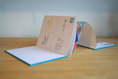
- Another unusual fold.

- White background.
- Pops of colour (which match the image) with the yellow text.

- Image continues over page.
- Diagonal layout with images.
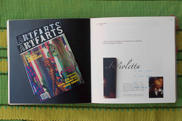
- Book layout.
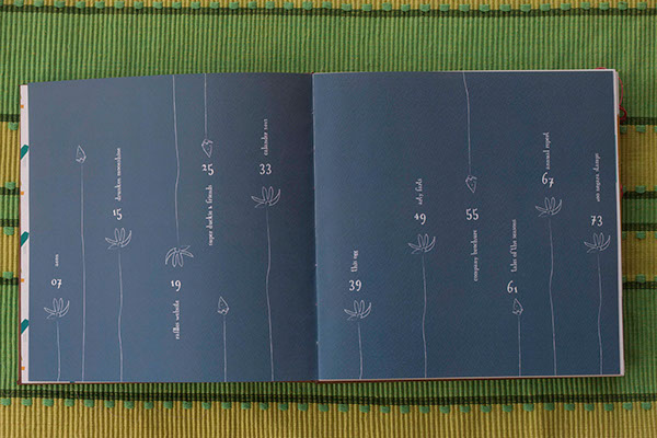
- Contents page.
- Good quality paper.

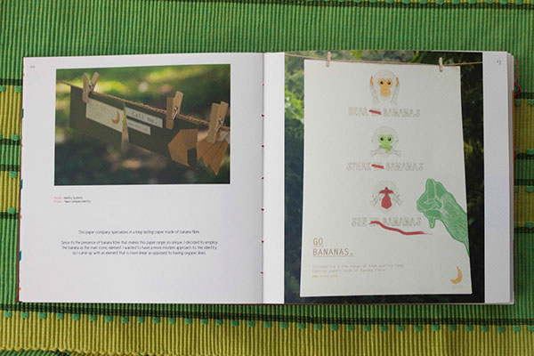
- Consistant colour theme.
- Artistic expression.

- White - sophisticated, sleek.
- Again making the most of a physical portfolio.
References:
http://mikenzijones.wordpress.com/2013/02/02/do-i-need-a-physical-portfolio/
http://designlecturer.tumblr.com/post/17660968081/9-ways-to-make-your-portfolio-suck
http://www.theloop.com.au/zacwilliams/portfolio/self-promotion/30116
http://www.behance.net/gallery/Portfolio-book/3678545
http://www.creativebloq.com/print-design/should-have-physical-portfolio-11410307
No comments:
Post a Comment