Tuesday 11 March 2014

Portfolio Ideas

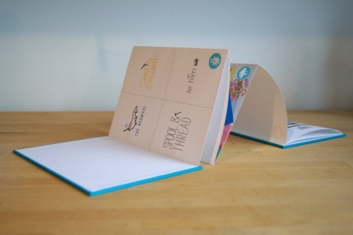
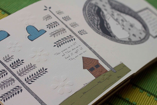
Messing around with layout for my portfolio pages.
- Book stretched across two pages?
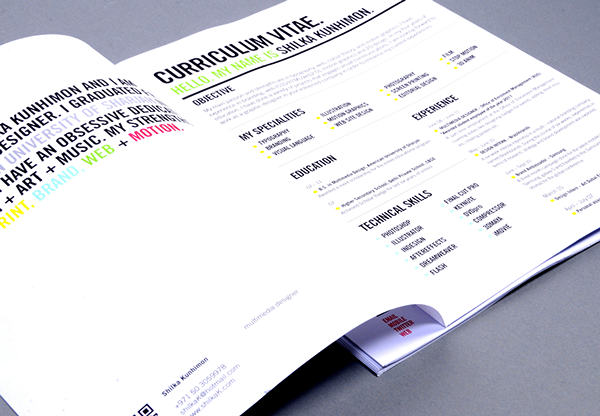
 - Playing with composition.
-Simplistic. Less busy. Can focus on one design per page.
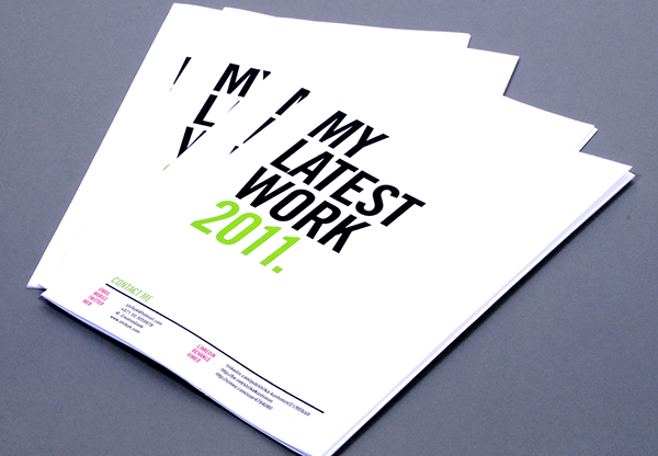
Adding a title page. Brings the design together. 

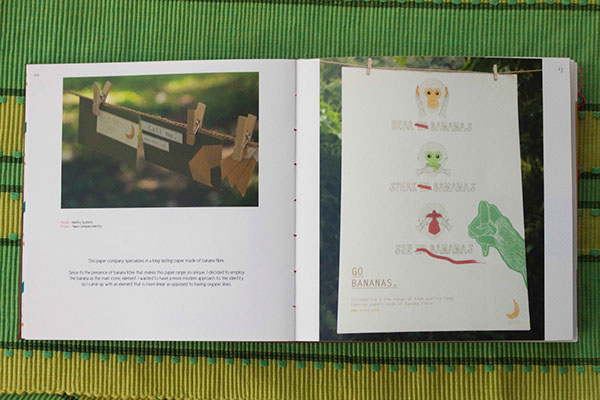
Same layout for Green Design. Change colour so that it fits design.


Sunday 9 March 2014

Print Portfolio Ideas

" In addition, to make a CV more interesting and engaging, information design was explored."
More here: https://www.behance.net/gallery/Innovation-in-Portfolio-Design/2329200
- Pops of colour
- Sleek, sophisticated
- Simplistic, bold layout
- Use of information design reinforces skills


- Images take up most of page, with only one of two sentences below
- Good quality print
- Lack of colour; images speak for themselves with nothing to distract you from them
- Stickers are playful and different


- Consistent colour scheme; consistent branding
- Shows personality


- Very different style; more playful. Less professional appearances?
- Good quality print
- Quirky and charming
- Booklet


References:
http://www.coroflot.com/mreyes/mr-eyes-2008-portfolio-packaging
http://designspiration.net/image/611978720376/
http://www.melaniechadwick.com/portfolio-design-layout-print/

Tuesday 25 February 2014

Exhibition Layout Ideas

- Thinking creatively with the space.


- This exhibition featured a colour-in muradoole by illustrator Jon Burgerman and an interactive installation by Alex Bec, comprising 2,500 post-it notes for visitors to write something they wanted to show off about.- Making the show interactive for the viewers.
- Out of the ordinary.


-Work hung on wires
- Interesting presentation of work.


- Busy.
- Decorative patterns.
- Work all links together throughout the exhibition.


References:
http://www.weheart.co.uk/2012/05/25/100-years-of-swiss-graphic-design/
http://papercutpanic.wordpress.com/category/exhibitions/
http://www.creative-inspiration.co.uk/?p=26029


Portfolio Layout Ideas

- Bright colour against black and white
- Little note on the back saying that you'd love to work with that company - something extra, stands out.
- Textures - making the most of a physical portfolio.
- Strong, bold typography


 - Fold out portfolio. Going away from usual formats. Adds interest and originality.


- Colourful, vibrant, energizing - looks appealing.
- Good quality materials.
- Another unusual fold.

- Clean layout.
- White background.
- Pops of colour (which match the image) with the yellow text.


- Images on top half, text below.
- Image continues over page.
- Diagonal layout with images.


- Textured front cover.
- Book layout.
- Contents page.
- Good quality paper.


- Collage image spreading across two pages.
- Consistant colour theme.
- Artistic expression.

- Engraved logo/name.
- White - sophisticated, sleek.
- Again making the most of a physical portfolio.


References:
http://mikenzijones.wordpress.com/2013/02/02/do-i-need-a-physical-portfolio/
http://designlecturer.tumblr.com/post/17660968081/9-ways-to-make-your-portfolio-suck
http://www.theloop.com.au/zacwilliams/portfolio/self-promotion/30116
http://www.behance.net/gallery/Portfolio-book/3678545
http://www.creativebloq.com/print-design/should-have-physical-portfolio-11410307